The Victorian Pride Centre
A visual evolution and landmark re-brand
Pride Centre Rebrand.
Designed as a visual evolution of the original brand and as a symbol for The Victorian Pride Centre community and spirit, the new brand mark honours the LGBTIQ flag.
The brandmark aperture becoming a visual link to the physical site; open and welcoming. The resulting shape is a ring: an encompassment and binding of enthusiasm and ideals. A juxtaposition of diversely divided colour, unification of round movement and amalgamating shapes.
The Victorian Pride Centre brandmark has life and will be a proud, iconic mark for the future.
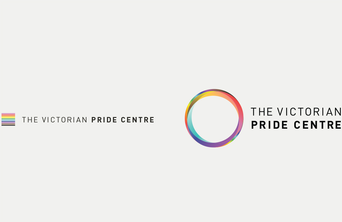
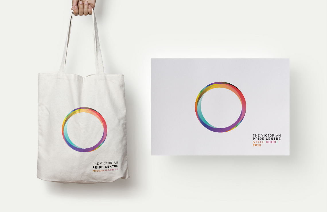

"The new, circular motif of rainbow colours is a symbol of our commitment to connecting people and organisations, of the vibrancy and strength of the communities we are working for, and celebration of our pride. "
Georgie Harman, VPC Communications Working Group Co-Chair